The impact of fonts in branding is grossly underestimated. Studies show that fonts play a crucial role in branding by influencing emotions and shaping the perception of a brand. Every font has a unique personality, and it is vital to select the font that matches your brand’s personality.
With an overwhelming selection of approximately 200,000 fonts available on the market, it can be challenging to determine which one is the right fit for your brand. However, by understanding the personalities associated with popular fonts used by brands, you can make an informed decision that will engage and captivate your target audience.
We have compiled a list of 20 widely used fonts, in 4 different categories, each with a distinct personality. By considering these font personalities, you can ensure that your brand’s typography not only aligns with your identity but also leaves a lasting impression on consumers. Let’s dive in and discover the font that best captures the essence of your brand, making it more engaging and memorable.
1. Traditional, timeless & classic fonts
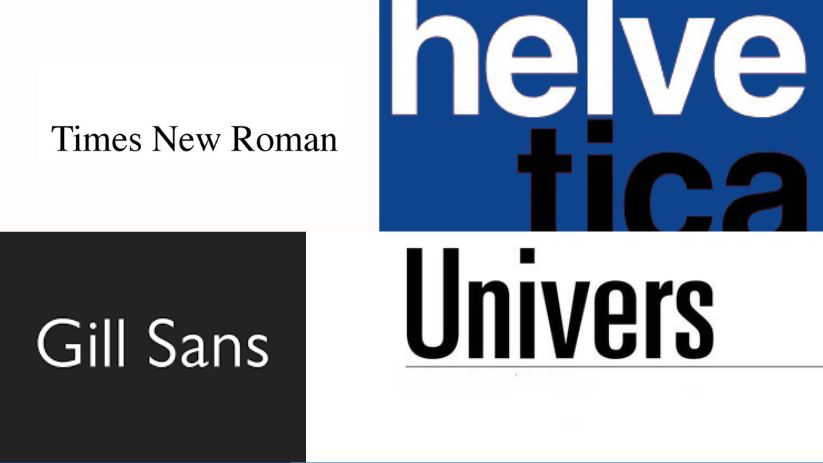
- Helvetica: Did you know that Helvetica is the most popular font used in the world? It is a sans serif typeface font. It is widely used for internal conferences as the font displays little to no emotions due to no ornaments supporting the font and maintains a strict formal tone, displaying clear information. It is used most popularly to create logos for brands in automation & electrical appliances like Jeep & Panasonic.
- Times New Roman: Times New Roman is a serif font that was commissioned by The British newspaper, The Times in 1931. It has since been used heavily in publications like newspapers, books & magazines due to its traditional accents. Brands that want to exude traditional and trustworthy personality traits use Times New Roman, for example, HSBC, the banking firm uses Times New Roman in their logo.
- Univers: Univers has the advantage of pairing well with so many fonts that it is employed heavily in corporate branding. It is used to denote signage, maps & even on computer systems. Apple used the Univers font on their laptop keyboards until 2007.KPMG and UNICEF use Univers in their logos as well.
- Gill Sans: Gill Sans is known as the British version of the font Helvetica. It was primarily used in London Railways systems due to its clean and balanced typeface. It is currently used by the BBC network on their channel, as their logo & as their corporate typeface.
- Optima: Optima is a traditional sans serif typeface that embodies the humanist typeface. It has a distinctive ‘O’ and it is used widely as it is a friendlier version of a traditional font. It is used in book publications to signage. Some companies that use this font are Nordstrom, Aston Martin & Yahoo!
2. Elegant, sophisticated & refined fonts.
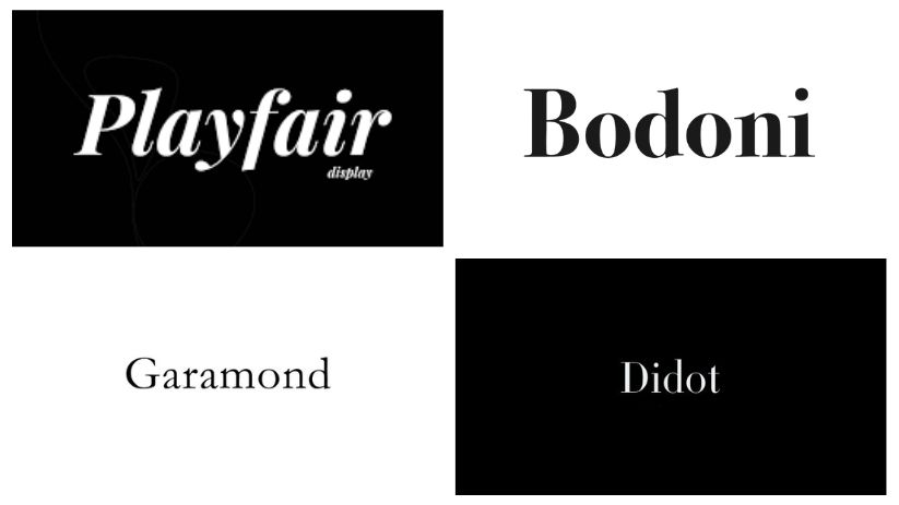
- Didot: Didot personifies a sophisticated and clean look which is perfect for elite advertising houses like Harper’s Bazaar and Vogue. Designers love to opt for this font in luxury goods due to its upscaled & aesthetic edges.
- Bodoni: Bodoni is a unique font with the letters having a stark difference between thin & thick lines. It has a thin serif which gives it an elegant & refined look. Over the years, the font has been admired and edited to suit every digital age. It is popularly known to be the font used in the movie poster of “Mama Mia!” and luxury brands like Calvin Klein and Armani use Bodoni in their logos.
- Garamond: Garamond fonts are the most eco-friendly fonts as their minimal typeface reduces the usage of ink while printing. A font as sophisticated and classical as Garamond is used in luxury brands like Rolex and Abercrombie and Finch in their logos. It is particularly popular in book printing fonts & for body texts.
- Playfair Display: Playfair Display has a high contrast between its thick and thin lines. The regular version of Playfair Display portrays a clean & elegant design, but it is often used in an italics style which is decorative in nature. Brands prefer to use this font for logos or headings as it is hard to read in the body of text. It plays well in a fashion and editorial setting. Vogue Espana uses Playfair Display on their website as headings.
3. Bold, futuristic & modern fonts
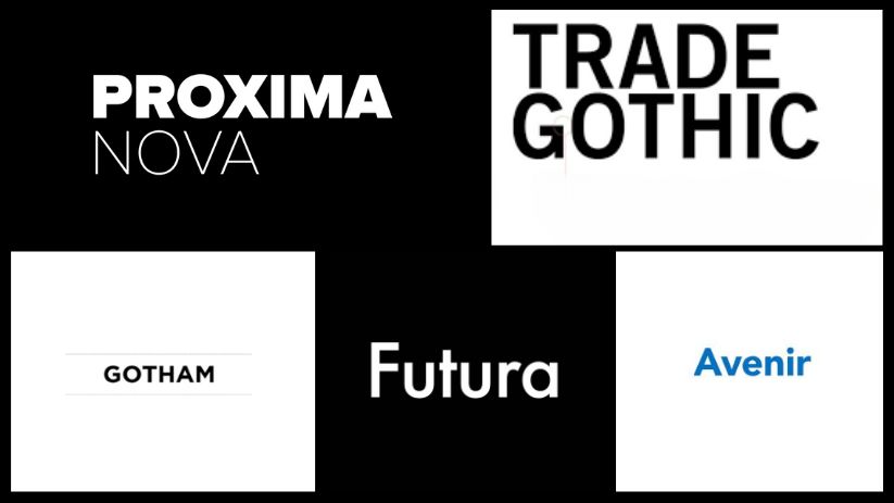
- Gotham: Gotham has a broad design with a wide aperture making it the perfect font to use when making a bold statement. Universities popularly use Gotham to attract college applicants. It was noticeably seen in Barak Obama’s presidential campaign making it a right fit for poster fonts as well. Brands like Taco Bell, Spotify, TGI Fridays, DC Comics, and Cartoon Network use it in their logo for visibility.
- Proxima Nova: Proxima Nova is becoming a popular choice for brands that are new-aged & modern. It has a geometric appearance with modern proportions. It works well in headings and body of texts and is popularly used by brands that target millennials and Gen Z like Buzzfeed and Mashable. It is widely used in the technology, fashion, and media industries.
- Avenir: Avenir is a French word that translates to ‘future’. It is a geometric sans serif typeface. UI/UX designers use this font to make webpages appear modern and futuristic as it has a sleek design. Fashion icon Karl Lagerfeld uses Avenir for his logo. It is also used by the automotive industry and brands like Toyota and Land Rover use Avenir in their logos.
- Trade Gothic: The condensed version of the Trade Gothic font is widely used in the media and advertising industries for its headlines due to its bold strokes. It is bold, impactful, and stands out even when paired with other fonts. It is used by L’Oréal and YouTube in their logos.
- Futura: Futura is a retro yet futuristic font that is popularly used in the film industry, it works well in videos and display copies for print adverts too. It has a very minimal look and is opted for in fashion houses like Dolce and Gabbana and Louis Vuitton in their logos. Futura’s medium version is also used in the banking industry.
4. Legible, approachable & clean fonts.
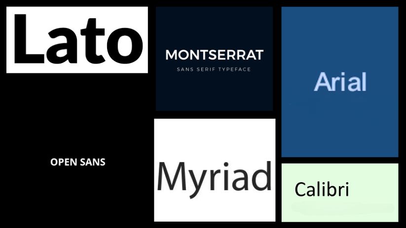
- Lato: Due to its legibility, clarity & simplicity Lato has been the most popular Google font used in the last 6 years. It is popularly used by many webpage designers as it is clean and easy to read. It is also used in publications and billboards.
- Monserrat: Monserrat is a geometric and simplistic design with subtly rounded corners giving it a modern yet clean design. It personifies approachability, due to which It is popularly used in the gaming industry. Monserrat is also used by colleges in their study material due to its legibility. Brands like Medium and Udemy use Monserrat in their logos.
- Open Sans: Open Sans was commissioned by Google in 2011 and is the inspiration for Google’s own font called PF Sans. It has a very friendly and approachable appearance which fits well with Google’s personality. It is mostly used in web designs and pages, and print media. It is the official font for UK the UK’s Labour, Co-operative, and Liberal Democrat parties.
- Myriad: Myriad is a versatile sans serif font that was initially used by Apple in its marketing collaterals and branding. Now, Myriad is used by Visa, Adobe, and Walmart in their logos to appear friendly and approachable.
- Arial: Arial was created for IBM & Microsoft systems; Arial’s design is based on the font family of Helvetica. Arial is a web-safe font, and it is used by companies like Microsoft and Google who use Arial as their primary font on their web pages. Arial maintains a formal tone like Helvetica, and it is widely used for textual settings in publications and magazines. It is also used to display adverts on billboards.
- Calibri: Calibri has subtly rounded stems & corners and is a sans serif font, due to its proportions it is easy to read even on smaller font sizes. Windows applications use Calibri as its default font on applications like Word.
By understanding the personalities and characteristics associated with popular fonts used by businesses, you can make an informed decision that aligns with your brand’s identity and leaves a lasting impression on consumers. It’s crucial to consider your target audience, industry, and overall brand image when choosing a font. By doing so, you can ensure that the font you select captures the essence of your brand, making it more engaging and memorable.