Did you know 93% of buyers focus on brand color when buying a product? That is because color increases brand recognition by 80%.
For instance, whenever we see bright red and yellow together, our mind perceives those big, beautiful golden arches and our mouths start salivating, thinking of those crispy fries and burgers. You know the brand we are talking about – McDonald’s.
They have, time and again, used their creativity, wit, and attention-grabbing colors to deliver their message effectively and uniquely position themselves among their target audience.
Here is an example of how brilliantly McDonald’s used the power and recognizability of their brand and product colors in the form of abstract art in one of their recent ads.
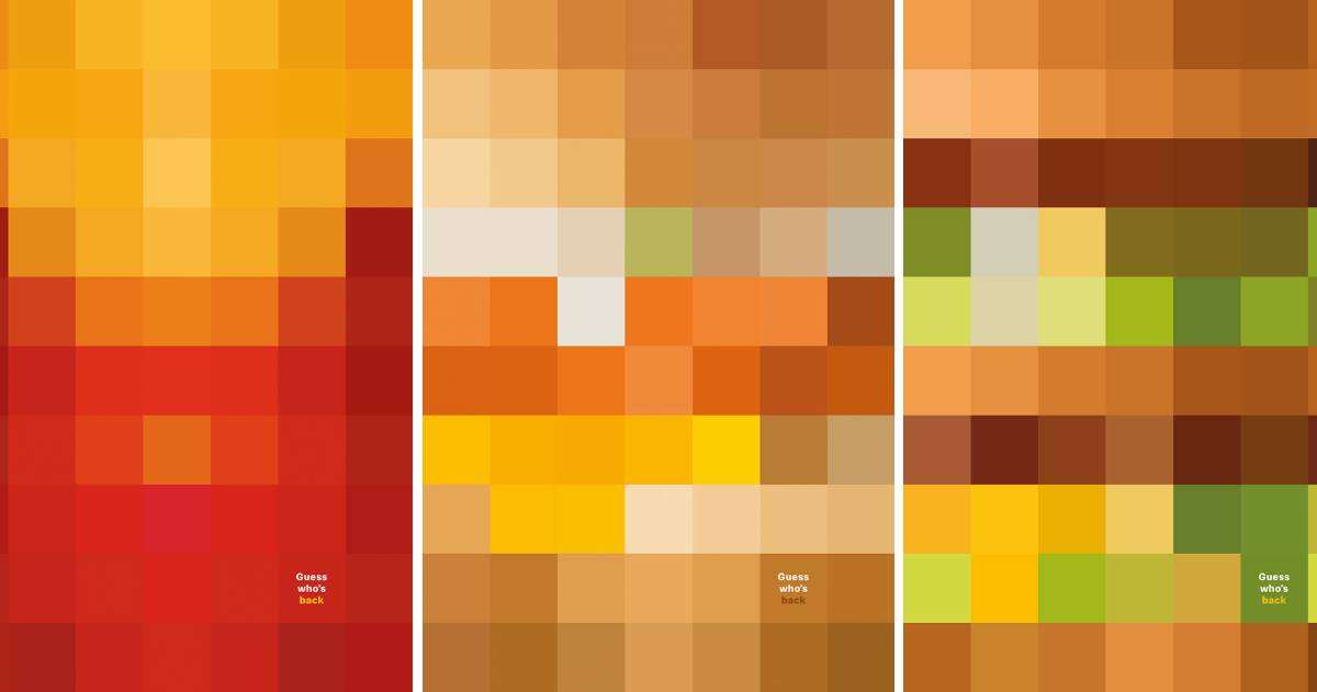
Source: TBWAParis
In the above 70-pixel abstract images used to announce the opening of McDonald’s in France, they neither used their logo nor brand signature. But instead, they played on the recognisability of the famous products on their menu – french fries and burgers, and their only copy read “Guess who’s coming to your town?”
A masterstroke, right?
And it is not just McDonald’s that understands and uses the real power of brand colors to tell their stories and connect with their audience. There are a plethora of brands that master this art. In one of their recent campaigns to promote recycling, Coca-cola used their colors and iconic white brand element to point to the closest recycling bins available.
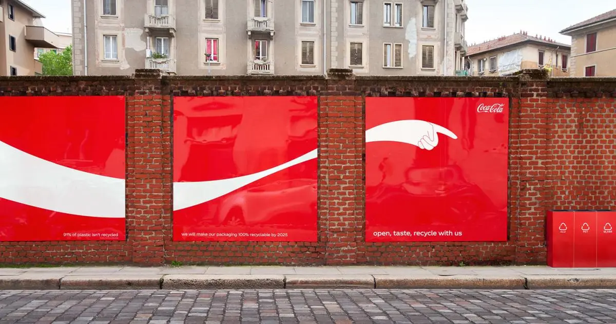
Source: Adweek
Even though both the brands have the primary red color in their brand logos, they have differentiated themselves with their stories and created various emotions around their products. For instance, when we see McDonald’s red and yellow, Happy Meal, and Family Time pop into our minds. Whereas when we see Coca-Cola’s red and white, we think Open Happiness, Refreshing, and Party Time.
Brand colors paired with proper messaging can help brands evoke the right emotions, thereby, helping create a direct and emotional bond with the target audience.
Reboot, an online marketing agency conducted an experiment where they hired a graphic designer to create logos of 5 made-up companies and showed them to their participants. The participants were given 10 minutes to study the logos. Upon asking to recall the logos, 78% of them were able to recall the primary color of the logo in comparison to 43% who remembered the name.
Apart from brand recall and recognition, how exactly do colors affect consumer behavior? And most importantly, how can you, as a brand manager or marketing manager, leverage the real power of colors to improve brand recall and recognition.
For that, we will have to explore and understand the psychology and emotions behind colors. Different colors evoke different emotions. For example, the above-mentioned brands, McDonald’s and Coca-Cola use their primary brand color, red, to evoke various emotions like passion, and warmth. McDonald’s tapped into the ‘warmth’ side of red by positioning themselves as the place for families, whereas, Coca-Cola has tapped into the ‘passion’ side of red that evokes passion and power among their relatively young audience. And it doesn’t hurt that their reds are easy to spot.
So, how can you, as a brand, use colors to evoke the right emotions among your target audience?
How to Use Colors to Evoke the Right Emotion
Many businesses often use the color blue to decorate their offices as people are more productive in blue rooms. Various high-street, lifestyle brands like Nike, Puma, Chanel have their logos in black to assert confidence, power, and global standing.
Colors have always been closely linked to emotions; they can make us feel happy, sad, ecstatic, or hungry because of biological conditioning and cultural imprinting.
By strategically using the right colors, brands can evoke emotions like trust, happiness, joy, love, FOMO, or loyalty through their ad creatives which can help them stand out in the noise of social media.
Let us explore a few fundamental emotions associated with colors.
1. Passionate
Warm, bright, and happy colors like red, orange, and yellow can make people feel passionate and optimistic. Such colors are known to increase heart rate and make people excited.
Red is closely related to passion, love, and excitement which is why it is widely used by brands during valentines and announcements of offers, sales, or discounts. Coca-Cola, H&M, Netflix are among the top brands having red logos that evoke emotions like passion, excitement, love & comfort, respectively.
Red is one of the most dynamic colors — meaning it can evoke opposing emotions. For example, red symbolizes love and is widely used during Valentine’s. On the other hand, it is also used to grab the attention of the drivers in danger and other traffic signs.
If your goal is to draw attention to a certain element, then red can do the job. But since it is a tricky color, use it in moderation. Netflix’s sign-in page is a great example of the usage of the color red to grab attention and pursue visitors to click on their call-to-actions. And since it is used strategically, in moderation, it is not overwhelming the visitors.
2. Joy and happiness
While red is associated with passion, one of the other warm colors, yellow, is used to communicate playfulness, friendliness, and happiness. Brands like Snapchat, McDonald’s, Post It use yellow in their logos to communicate youthfulness, happiness, and playfulness, respectively.
Yellow, bright and intense, is the color of happiness, optimism, creativity, and warmth. It can quickly grab attention and is also known for invoking strong feelings.
However, it is a tricky color to use in marketing considering, it can be abrasive and can cause visual fatigue when overused. In addition to that, according to an article published by HubSpot, 22% of people consider the color yellow cheap.
Nonetheless, when used strategically, yellow can draw attention to the right information and can invoke happy, warm, and energetic feelings. Yellow also makes for an effective color for CTAs against white backgrounds.
3. Trust & loyalty
The color blue is closely associated with trust, loyalty, calmness, and safety since it is found in nature that represents strength, wisdom, and trust. It is also considered the color of reason which is why it is one of the most frequently used colors for logos, especially in the technology industry. Brands looking to project stability and reliability add blue to their marketing efforts and advertisements.
PayPal, IBM, GE, Intel, and HP are a few famous brands that have blue logos to communicate security and dependability. Dark blue is used by more professional brands, whereas light blue gives a friendlier and more social feel, is used by brands like Twitter, Flickr, etc.
Seeing the color blue can cause our brains and body to create calming chemicals. It is one of the reasons why it is described as the favorite color by many people. But since blue is a cool color, its overuse can evoke sadness, grief, pensiveness among the viewers, and your brand might come across as aloof and disengaging.
4. Feminine and vibrant
If you plan to launch or market a feminine product or a brand, then pink is a safe bet. The color pink is a young, playful, and romantic color used to express femininity. It is a sweet color that can be used by brands targeting women and a few LGBTQIA+ communities.
Brands like Barbie, Cosmopolitan, Victoria’s Secret that target mostly women have their logos in pink. Additionally, many brands like Lyft, Vineyard Vines, and Lemonade, targeting both men and women, are breaking stereotypes and using pink in their logos.
Pink is also often associated with childhood memories and sugary treats. This is why brands like Dunkin Donuts and Baskin Robbins have pink in their branding and marketing.
5. Powerful and edgy
The color black is associated with power, edginess, elegance, and sophistication. Brands that want to assert themselves as powerful, timeless, and traditional often use black in their logos. For instance, brands like The New York Times and Hugo Boss. This color is often used by lifestyle and clothing brands and rarely by health & fitness brands considering it also reflects heaviness, mourning, and oppression.
In marketing collaterals, black is used either sparingly for CTAs or as background due to its high-contrast nature. Similar to purple, black exudes luxury and sophistication and much bolder confidence.
Creative is Still the Most Important Aspect of an Advertisement
A lot of times advertisements are conceptualized, created, and implemented based on marketers’ hunch, their understanding of the product, and target audience. Various pieces of information are missed due to the biases and lack of factual, data-backed insights.
For instance, most marketing and brand managers give too much importance to media buying and ad placement, when the creative itself holds much more value. According to a study done by Nielsen of over 500 media campaigns, the ad creative accounts for 47% of sales contribution.
Creating ads that not only deliver the right message and hit the marketing goals but also cut through the noise to effectively reach the target audience is a herculean task. But what if there was a tool that could leverage the power of creative intelligence along with artificial intelligence to help you choose the right creatives for your brands?
At Incivus, we have built a Creative Intelligence Platform, using cutting-edge technologies like NLP, computer vision, and artificial intelligence that helps you conceptualize, evaluate and optimize ads. And as a result, maximize ROI from ad spend.
Using Incivus, you get an easy-to-understand and actionable evaluation of different aspects of ads like colors, branding, emotions, characters, backgrounds, and various other creative variables.
What makes our evaluations impactful?
Our platform evaluates your ads against campaign goals, past data, category, and industry data making the insights more effective. This would not only help you pick the right ads for your campaigns but would also save costs on A/B testing and help you launch successful campaigns at scale.
To know more about our product, visit https://incivus.ai/product/ or let us get on a call. We would love to explore various ways we can help you get the most out of your campaigns.